Color Palettes

Golden Hour color palette

Amber, honey, peach and bronze: sunset light turned into a palette. A warm, glowing luxury for hotels, bronzed makeup, outdoor events and restaurants.

LUXURY COLOR PALETTE
GoldenHour

Amber, honey and bronze

Open in editor

The colors of Golden Hour

Tap a color to copy its code.

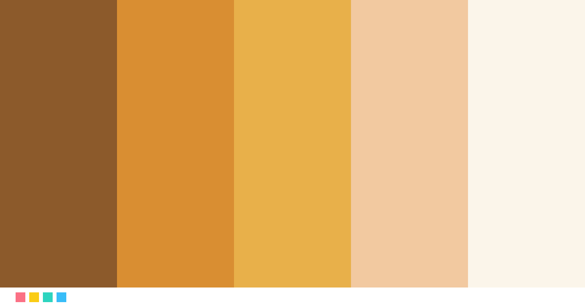
Bronze#8C5A2B · RGB 140, 90, 43
≈ Raw umber
Amber#D98E32 · RGB 217, 142, 50
≈ Harvest gold
Honey#E8B04A · RGB 232, 176, 74
≈ Honey
Peach#F2C9A0 · RGB 242, 201, 160
≈ Desert sand
Ivory#FBF5EA · RGB 251, 245, 234
≈ Old lace

Best for

HotelsBeauty and cosmeticsEventsRestaurants

See it in use

Logo

Isabel LaurentCreative Director
Business card
Limited edition
Packaging
New collectionDiscover
Website

Try this next

Name color paletteType a name and get your own color story paletteColor TowerThe color palette game: stack blocks in a gradientSelfie color analysisFind your season and best colors from one photo
See all free tools →

How to use the Golden Hour palette

Use Ivory (#FBF5EA) as the background or base color, Bronze (#8C5A2B) for text and key blocks, and Honey (#E8B04A) only for details: a logo, a line, a button. Luxury shows when the boldest color appears sparingly.

Fonts that match

A geometric sans serif like Montserrat, Jost or Futura in a light weight, with generous letter spacing. For a warmer touch, pair it with a serif like Cormorant Garamond for headings.
More luxury palettes

ObsidianTealDeep teal and copperLuxuryEmeraldEmerald green and goldMidnightSapphireSapphire blue and silverVelvetBurgundyBurgundy and dusty roseChampagneGoldChampagne and goldSoftBlushSoft pink and rose gold

See all 24 luxury palettes →

Color palettes: Golden Hour color palette

Frequently asked questions

What colors are in the Golden Hour palette?

The Golden Hour palette has these colors: Bronze #8C5A2B, Amber #D98E32, Honey #E8B04A, Peach #F2C9A0, Ivory #FBF5EA.

What is the Golden Hour palette good for?

It is ideal for hotels, beauty and cosmetics, events and restaurants. Use the lightest color as the base, the darkest for text and the boldest only for details.