Color Palettes

Soft Blush color palette

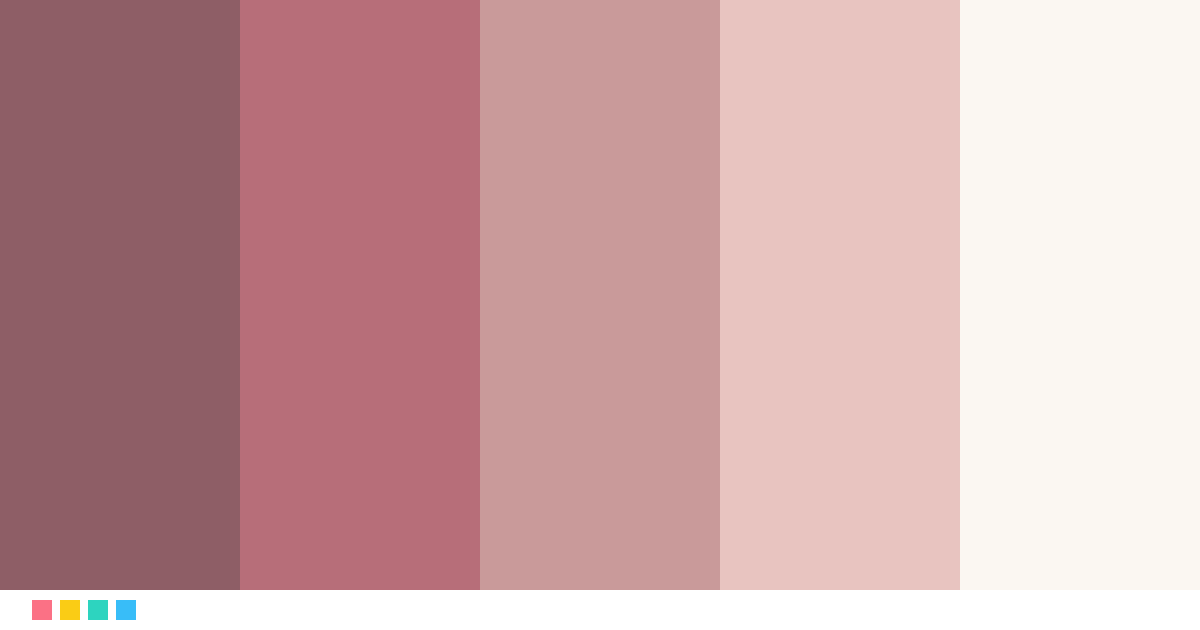
Blush, dusty pink and rose gold on ivory. A soft, feminine palette for beauty brands, bridal, spas and fashion boutiques.

LUXURY COLOR PALETTE
SoftBlush

Soft pink and rose gold

Open in editor

The colors of Soft Blush

Tap a color to copy its code.

Mauve#8E5E66 · RGB 142, 94, 102
≈ Marsala
Rose Gold#B76E79 · RGB 183, 110, 121
≈ Rose gold
Dusty Pink#C99A9A · RGB 201, 154, 154
≈ Dusty rose
Soft Blush#E8C4C0 · RGB 232, 196, 192
≈ Baby pink
Ivory#FBF7F2 · RGB 251, 247, 242
≈ Off-white

Best for

Beauty and cosmeticsWeddingsFashionSpa and wellness

See it in use

Logo

Isabel LaurentCreative Director
Business card
Limited edition
Packaging
New collectionDiscover
Website

Try this next

Name color paletteType a name and get your own color story paletteFace shape detectorFind your face shape, best haircuts and glassesFamily birth flower bouquetEveryone's birth flowers in one bouquet
See all free tools →

How to use the Soft Blush palette

Use Ivory (#FBF7F2) as the background or base color, Mauve (#8E5E66) for text and key blocks, and Soft Blush (#E8C4C0) only for details: a logo, a line, a button. Luxury shows when the boldest color appears sparingly.

Fonts that match

A classic serif like Playfair Display or Cormorant Garamond for headings and the logo, with a clean sans serif like Montserrat or Lato for body text. Use letter-spaced capitals for labels and menus.
More luxury palettes

OnyxGoldBlack and goldRoyalAmethystRoyal purple and goldIvoryPearlIvory and pearl neutralsRoseGoldRose gold and copperNavyBrassNavy and brassBlackMarbleBlack marble and gold

See all 24 luxury palettes →

Color palettes: Soft Blush color palette

Frequently asked questions

What colors are in the Soft Blush palette?

The Soft Blush palette has these colors: Mauve #8E5E66, Rose Gold #B76E79, Dusty Pink #C99A9A, Soft Blush #E8C4C0, Ivory #FBF7F2.

What is the Soft Blush palette good for?

It is ideal for beauty and cosmetics, weddings, fashion and spa and wellness. Use the lightest color as the base, the darkest for text and the boldest only for details.