Color Palettes

Ivory Pearl color palette

Off-whites, pearl and greige: a quiet, bright kind of luxury. It works beautifully for interior design, high-end real estate, spas and wedding stationery.

LUXURY COLOR PALETTE
IvoryPearl

Ivory and pearl neutrals

Open in editor

The colors of Ivory Pearl

Tap a color to copy its code.

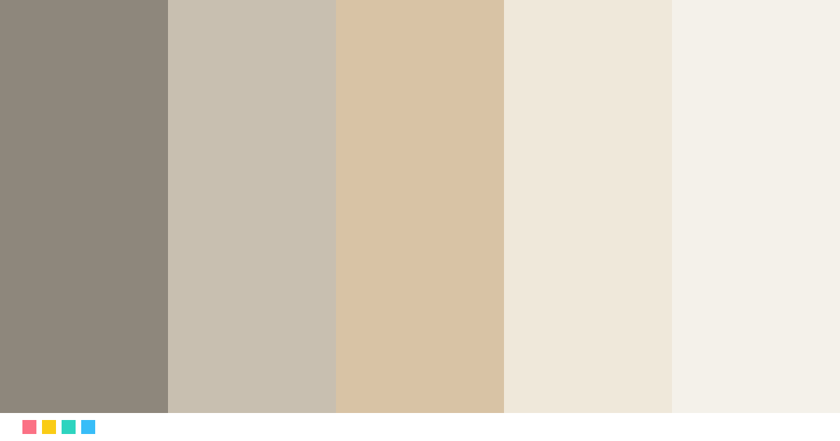
Warm Gray#8E877C · RGB 142, 135, 124
≈ Smoke gray
Greige#C8BFB0 · RGB 200, 191, 176
≈ Silver
Champagne#D8C3A5 · RGB 216, 195, 165
≈ Nude
Ivory#EFE8DA · RGB 239, 232, 218
≈ Alabaster
Pearl#F4F1EA · RGB 244, 241, 234
≈ Linen

Best for

WeddingsInterior designSpa and wellnessReal estate

See it in use

Logo

Isabel LaurentCreative Director
Business card
Limited edition
Packaging
New collectionDiscover
Website

Try this next

Name color paletteType a name and get your own color story paletteSelfie color analysisFind your season and best colors from one photoWhat color is your voice?Speak for 5 seconds and turn your voice into a color
See all free tools →

How to use the Ivory Pearl palette

Use Pearl (#F4F1EA) as the background or base color, Warm Gray (#8E877C) for text and key blocks, and Champagne (#D8C3A5) only for details: a logo, a line, a button. Luxury shows when the boldest color appears sparingly.

Fonts that match

A classic serif like Playfair Display or Cormorant Garamond for headings and the logo, with a clean sans serif like Montserrat or Lato for body text. Use letter-spaced capitals for labels and menus.
More luxury palettes

RoseGoldRose gold and copperNavyBrassNavy and brassBlackMarbleBlack marble and goldEspressoCaramelCoffee browns and caramelArtDecoBlack, gold and emeraldOldMoneyOld money aesthetic

See all 24 luxury palettes →

Color palettes: Ivory Pearl color palette

Frequently asked questions

What colors are in the Ivory Pearl palette?

The Ivory Pearl palette has these colors: Warm Gray #8E877C, Greige #C8BFB0, Champagne #D8C3A5, Ivory #EFE8DA, Pearl #F4F1EA.

What is the Ivory Pearl palette good for?

It is ideal for weddings, interior design, spa and wellness and real estate. Use the lightest color as the base, the darkest for text and the boldest only for details.