Color Palettes

Quiet Luxury color palette

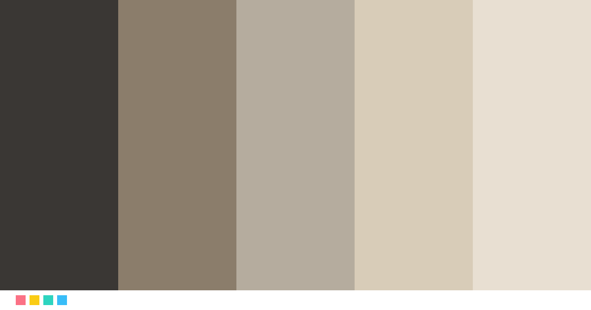
"Quiet luxury" is luxury you do not notice at first: oatmeal, stone, taupe, cashmere and charcoal. The colors of expensive clothes without logos, ideal for fashion, interiors and wellness.

LUXURY COLOR PALETTE
QuietLuxury

Quiet luxury neutrals

Open in editor

The colors of Quiet Luxury

Tap a color to copy its code.

Charcoal#3A3734 · RGB 58, 55, 52
≈ Onyx
Taupe#8B7D6B · RGB 139, 125, 107
≈ Gray
Stone#B5AC9E · RGB 181, 172, 158
≈ Mushroom
Oatmeal#D8CCB8 · RGB 216, 204, 184
≈ Pearl gray
Cashmere#E8DFD2 · RGB 232, 223, 210
≈ Almond

Best for

FashionInterior designSpa and wellnessBeauty and cosmetics

See it in use

Logo

Isabel LaurentCreative Director
Business card
Limited edition
Packaging
New collectionDiscover
Website

Try this next

Name color paletteType a name and get your own color story paletteWhat color is your voice?Speak for 5 seconds and turn your voice into a color16 personality type colorsTake an 8-question quiz and get your image color
See all free tools →

How to use the Quiet Luxury palette

Use Cashmere (#E8DFD2) as the background or base color, Charcoal (#3A3734) for text and key blocks, and Oatmeal (#D8CCB8) only for details: a logo, a line, a button. Luxury shows when the boldest color appears sparingly.

Fonts that match

A geometric sans serif like Montserrat, Jost or Futura in a light weight, with generous letter spacing. For a warmer touch, pair it with a serif like Cormorant Garamond for headings.
More luxury palettes

MochaMousseMocha brown tonesImperialRubyRuby red and goldArcticPlatinumPlatinum, silver and ice blueTuscanTerracottaTerracotta and oliveRivieraBlueRiviera blue and sandForestCognacForest green and cognac

See all 24 luxury palettes →

Color palettes: Quiet Luxury color palette

Frequently asked questions

What colors are in the Quiet Luxury palette?

The Quiet Luxury palette has these colors: Charcoal #3A3734, Taupe #8B7D6B, Stone #B5AC9E, Oatmeal #D8CCB8, Cashmere #E8DFD2.

What is the Quiet Luxury palette good for?

It is ideal for fashion, interior design, spa and wellness and beauty and cosmetics. Use the lightest color as the base, the darkest for text and the boldest only for details.