How to choose your wedding colors
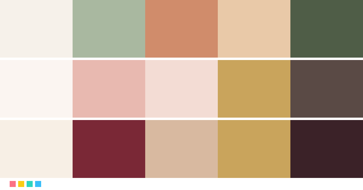
Start with the season and the venue: earth tones and sage green shine in the countryside, blues and turquoise by the sea, and wine and deep greens in winter. Choose a main color, a softer secondary one, a light neutral and a metallic, like gold or silver, for the details.
Where to use each color
The light neutral goes on stationery, tablecloths and backgrounds; the main color on flowers, bridesmaid dresses and ribbons; the secondary color supports it in the bouquet and on the table, and the metallic appears on flatware, chargers, candles and the invitation lettering.
Share the palette with your team
Download the board with the colors and their codes and send it to your partner, your planner, your florist or your printer. That way everyone works with the same shades.
Frequently asked questions
What colors should I choose for my wedding?
Think about the season, the venue and the style you both want. With those three answers we suggest five-color palettes: a light neutral, a main color, a secondary color, a metallic and a deep tone for text.
How many colors should a wedding palette have?
Ideally two or three key colors plus a neutral and a metallic. With more colors it's hard to make everything match across the flowers, the table and the stationery.
What wedding colors are popular in fall and winter?
Burgundy and champagne, emerald and gold, navy and blush, or red and pine green. These deep shades look elegant with candles and warm light.
And for a beach or summer wedding?
Turquoise and sand, coral and mint, or fuchsia and orange for a more festive party. Pair them with light neutrals and natural fibers.
Can I create a palette from a color I love?
Yes. Tap the rainbow under “A color you love?”, pick your color and we'll build a palette with it. We also show you the palettes in the collection that are closest to it.
How do I share the palette with my partner or florist?
Tap “Share with my partner” to copy a link to that palette, or “Download board” to save an image with the colors, their codes and how they look on the invitation, bouquet, table and dresses.